Showing posts with label books. Show all posts

30.9.11

septembers

It's the last day of September, which means it's time to write about a film I saw in May:


The Last September (1999), based on Elizabeth Bowen's novel of seventy years earlier.  A movie I chose from Netflix's streaming catalog because of my springtime penchant for period films featuring strong women, and which set off a string of great coincidences featuring four novels, three authors, two book covers, and one designer.

Novel #1 was Bowen's, the source material for the film.  Novel #2 was the book I was reading at the time: Doctor Copernicus, by John Banville.  Banville's name appeared on screen, to my surprise, as the movie opened.  It turns out he wrote the screenplay.


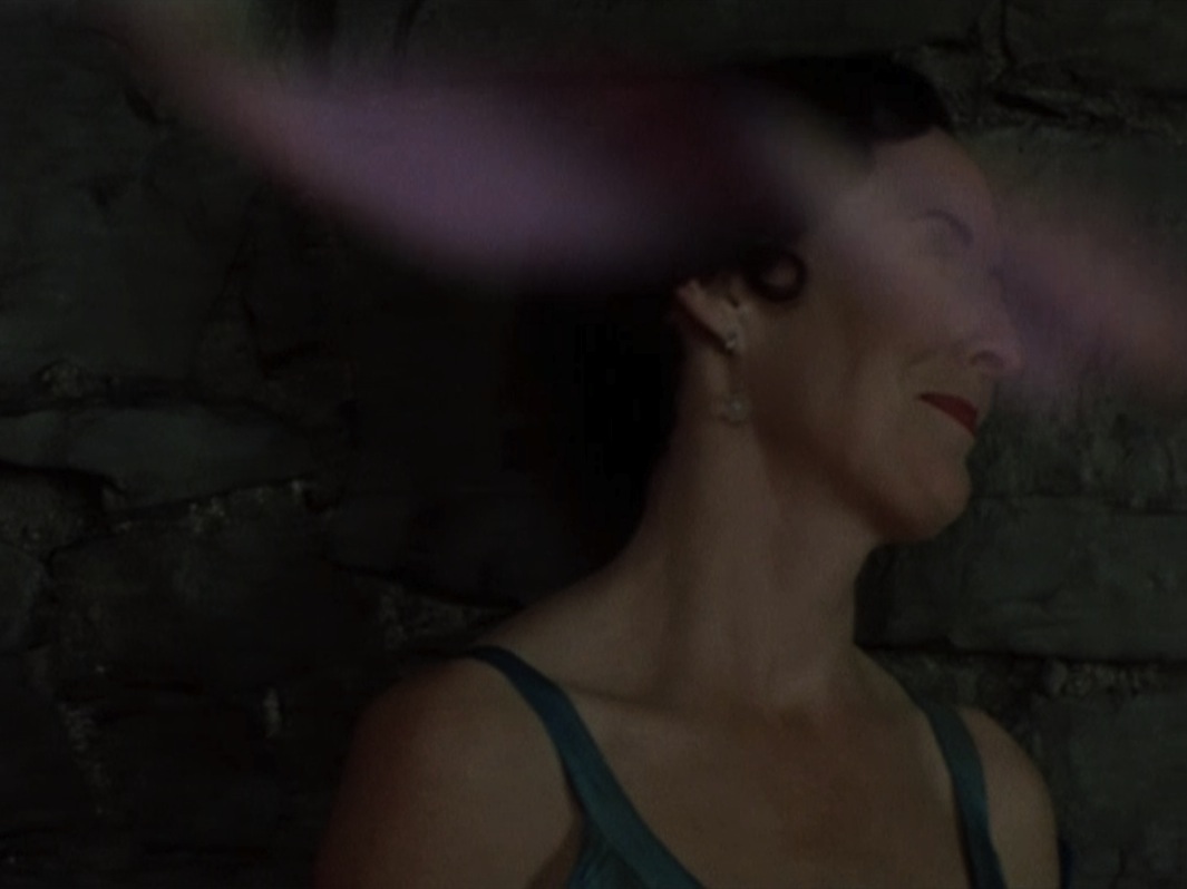
The Last September is set in Ireland.  Its filmic version is permeated by garnet & emerald hues, emerging from dramatic darkness.  While taking screenshots of Fiona Shaw in a party scene, appearing glorious and glowing through the translucence of whirling decorations, I noticed her similarity to the portrait of a woman on the cover of Novel #3, one I had read shortly before:


Dorothy Whipple's Someone at a Distance (1953), shown here in the Persephone Classics edition.

The portrait is of a woman named Pauline, painted by her husband, Sir James Gunn.  After a long search for the painting's date, I was happy to come across the website of the cover's designer, Megan Wilson.  Megan shared a lovely story with me about having tea beneath Pauline's portrait in the drawing room of its current owner's home, and confirmed my hunch that it was painted in the late 1920's -- in 1929, in fact, the year of publication of Novel #1.

What a wonderful visual and literary alignment, I thought, to find two studies of women arranged in red and green, resembling each other so closely, and representing fictional and actual figures in works completed in the same year.  Pauline, I thought, could have fit just as well on the cover of Bowen's novel as she does on Whipple's.

A day after my correspondence with Megan, I stepped into the used bookstore on my street, as one does when one is walking home on a warm evening in early May and curious to see what's new on the fiction shelves.  Bowen's The Last September fresh on my mind, I scanned the spines for her name and spotted a match.  I pulled it off the shelf to find that on the cover was . . . 

. . . another portrait of Pauline!  (This one entitled Pauline Waiting, from 1939.)  I recognized it instantly from my research the day before, and I purchased it just as quickly.  Only once I was out on the sidewalk again did I notice details such as the book's title, and then -- its cover designer -- Megan Wilson.

The visual memory that had led me to connect the filming of a Bowen novel with Wilson's cover of Pauline had, within a day, brought me to another Wilson cover of Pauline, this time on a Bowen novel.

And this Bowen novel, Novel #4, The Heat of the Day (1948), takes place again in September -- so far, in the Septembers of 1940 and 1942.  Of the first, on page 100 of the Anchor Books edition:

"In that September transparency people became transparent, only to be located by the just darker flicker of their hearts."


. . . . . . . . . . . . . . . . . . . . . . . . . . . . . . . . . . . . . . . . . . . . . . . . . . . . . . . . . . . . . . . . . . . . . . . . . . . . . . . . . . 

2.6.11

red & green(field)


Cover design by Roberto de Vicq de Cumptich.

. . . . . . . . . . . . . . . . . . . . . . . . . . . . . . . . . . . . . . . . . . . . . . . . . . . . . . . . . . . . . . . . . . . . . . . . . . . . . . . . . .

31.5.11

across sunset

Mallowy red in the night sky tonight, just before dark, brilliantly offset by what can only be described as a stripe of pistachio green.  I can think of any number of abstract painters who might have longed to re-create such a juxtaposition -- it was gone within seconds.1


Kenneth Noland, Across Center (1966) 2

. . . . . . . . . . . . . . . . . . . . . . . . . . . . . . . . . . . . . . . . . . . . . . . . . . . . . . . . . . . . . . . . . . . . . . . . . . . . . . . . . .

                                            1  William Boyd, Any Human Heart, (Penguin, 2010), 456.  First published 2002.
                                            2  Twenty feet across, according to Rosalind Krauss in her early 1966 essay, "Allusion and 
                                            Illusion in Donald Judd," reprinted in Perpetual Inventory (MIT Press, 2010), 99-100. 

. . . . . . . . . . . . . . . . . . . . . . . . . . . . . . . . . . . . . . . . . . . . . . . . . . . . . . . . . . . . . . . . . . . . . . . . . . . . . . . . . .

13.11.10

read & green: art book fair, part one


Amidst the zine-iness and scene-iness of the New York Art Book Fair at PS1, I spent time last Friday with several books in the upper range of outstanding-ness.    

The detail above is from a botanical illustration entitled "Douglas Maple," painted in gouache by Leanne Shapton.  Her reworking of The Native Trees of Canada, first printed in 1917, has just been published by Drawn & Quarterly of Toronto.  Selections of Shapton's paintings are visible at design*sponge, at the NYTimes, and at Drawn & Quarterly, where one can download a pdf of six of her leaf-and-branch pictures.

I'm especially drawn to Shapton's renderings of conifer branches, such as those of the Rocky Mountain Juniper and the Jack Pine.


Each image bleeds off the page and into the gutter.  It's a hefty book of color.

Shapton has painted books before, giving new meaning to the term "block book" by cutting blocks of wood to the size of novels and re-painting covers on them:


. . . . . . . . . . . . . . . . . . . . . . . . . . . . . . . . . . . . . . . . . . . . . . . . . . . . . . . . . . . . . . . . . . . . . . . . . . . . . . . . . .

10.11.10

persephone & omega

It may seem at first as though this post focuses on the gris rather than the verdigris.  The colors step in further below.  If you're impatient for pigment, imagine my stumbling across the bookshop in question on a cool, grey Christmas Eve afternoon years ago while sporting a lime green winter coat and red shoes.


27th Feb: Persephone.  Photo by scribbletaylor, 2009
 
Persephone Books is a small bookstore in Lamb's Conduit Street in London.  It is warm and welcoming and feels, to my recollection, like a milliner and print shop and early twentieth-century dry-goods store packed into one.  All their books are stacked on low, open shelves above worn wooden floors and have identical silver-grey covers.  Every book also shares an identical price of £10, so that readers can be unfettered from cost concerns and the distraction of dazzling dust jackets and instead be drawn to what they really like

Persephone republishes works of fiction and nonfiction, mainly by women, whose copyright has expired, whose existence has been nearly forgotten, or whose manuscripts have never before been printed.  In doing so, Persephone re-opens glimpses into the lives of imagined and historical women whose words are still vibrant even as you sense the dust falling from their stories with every page's turn.  

Most entrancingly, each novel, anthology, or diary is bound with endpapers reproducing a fabric or wallpaper design that is historically relevant to the time of the book's writing, or to the circumstances of its setting.  The snippet of endpaper below comes from a linen fabric designed in 1913 by Vanessa Bell, artist and older sister of Virginia Woolf, in the early days of the Bloomsbury artists' collective The Omega Workshop


It adorns the inside of Persephone's publication #43, Leonard Woolf's The Wise Virgins, which Woolf began writing on his honeymoon with Virginia in 1912 and completed the next year.  I don't know where any of the original fabric is still housed, the detailed circumstances of its creation, or if it even was given a name.  One place to start looking for answers may be the catalogue of an exhibition of Omega textiles shown at the Courtauld Institute in 2009.  The online summary of the show is quite good.   

If only there were a Persephone Fabrics as well, in the business of reprinting the abstract-graphic beauty of the Omega linens!
. . . . . . . . . . . . . . . . . . . . . . . . . . . . . . . . . . . . . . . . . . . . . . . . . . . . . . . . . . . . . . . . . . . . . . . . . . . . . . . . . .

~ F u r t h e r   r e a d i n g ~
  • A lovely photographic composition of Persephone + vintage textile, by Rosa Pomar 
  • The success of Persephone Books and my other favorite bookseller-publisher, New York Review Books, in reviving neglected literature.  At mediabistro.com
  • The cookbooks in Persephone's collection.  At thekitchn.com
  • Persephone Books' own blog, The Persephone Post
. . . . . . . . . . . . . . . . . . . . . . . . . . . . . . . . . . . . . . . . . . . . . . . . . . . . . . . . . . . . . . . . . . . . . . . . . . . . . . . . . .

1.11.10

poppy & prothonotary


One of my favorite small books: Das kleine Blumenbuch - In vielen Farben.  The little flower book - In many colors.  Fifty-eight plates of offset prints reproduced from botanical images drawn by Rudolf Koch and cut in wood by Fritz Kredel.  Published in 1933 by the Insel-Bücherei, Leipzig.

The Insel-Bücherei was founded prior to the first world war, and from its inception sought to sell, at affordable prices, short works such as novellas, poetry collections, essays, and groups of illustrations.  The series has been hugely successful in its 98 years of existence -- this Little flower book has been reprinted at least 27 times.

The early paperboard covers featured geometrical designs, primarily bicolor, as far as I can tell. On the Kleine Blumenbuch's cover, I find the handmade look of the green stripes and the little red stars wonderfully appealing.  (The stars are more easily visible if you click on the image to enlarge.)  Nowadays, the covers have become more complex in both design and color schematics.  The image of the poppy shown above is one of two flowers in a pattern now adorning the latest edition of the Kleine Blumenbuch:


Koch and Kredel are interesting figures, with a collaborative history that began years before the publication of this little book.  Koch was in his last year of life when the Kleine Blumenbuch was printed; his student Kredel soon emigrated to the United States, where he taught at the Cooper Union and where his illustrations found wide recognition.

It turns out that yellow has infiltrated all but my very first post so far, though I've set out to focus on red-green phenomena.  Because this post is about wildlife in books, I thought I might conclude with a photo of this bright yellow migratory phenomenon -- a photo of wildlife near books -- too bright and handsome to exclude: the prothonotary warbler who till this weekend was making a temporary home outside the New York Public Library.


Photograph by Ardith Bondi, The New York Times.

. . . . . . . . . . . . . . . . . . . . . . . . . . . . . . . . . . . . . . . . . . . . . . . . . . . . . . . . . . . . . . . . . . . . . . . . . . . . . . . . . .